How to Get the Most Out of Your Color Palette
As an agency, you know that color palettes are crucial for visual identities because they facilitate brand recognition through consistent use, evoke specific emotions to connect with audiences, differentiate brands in crowded markets, provide versatility in design applications, and consider cultural and psychological nuances for inclusive communication.

By strategically selecting colors that align with a brand’s values and message, companies can create a strong visual identity that resonates with their target audience, fosters brand loyalty, and sets them apart from competitors.
That is why the Color Palette in brandguide.io is designed to be as versatile and easy to use as possible, to streamline your work process.
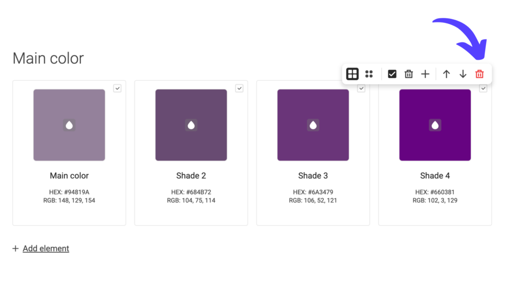
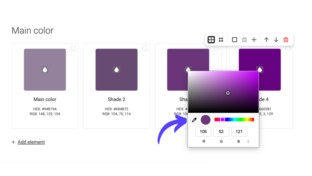
Understanding the Symbols in the Color Palette
The color palette is equipped with various features that streamline your workflow. Let’s decipher their meanings:
Square Grid vs. Circle Grid: These symbols allow you to choose how colors are displayed – either as squares or circles. Select the one that suits your visual preferences.
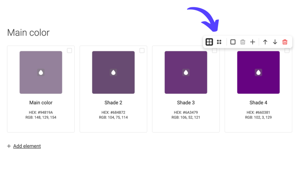
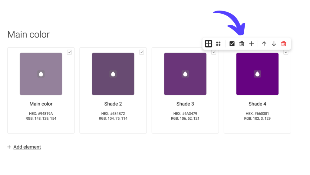
Marking Colors: Clicking the third symbol marks all colors at once.
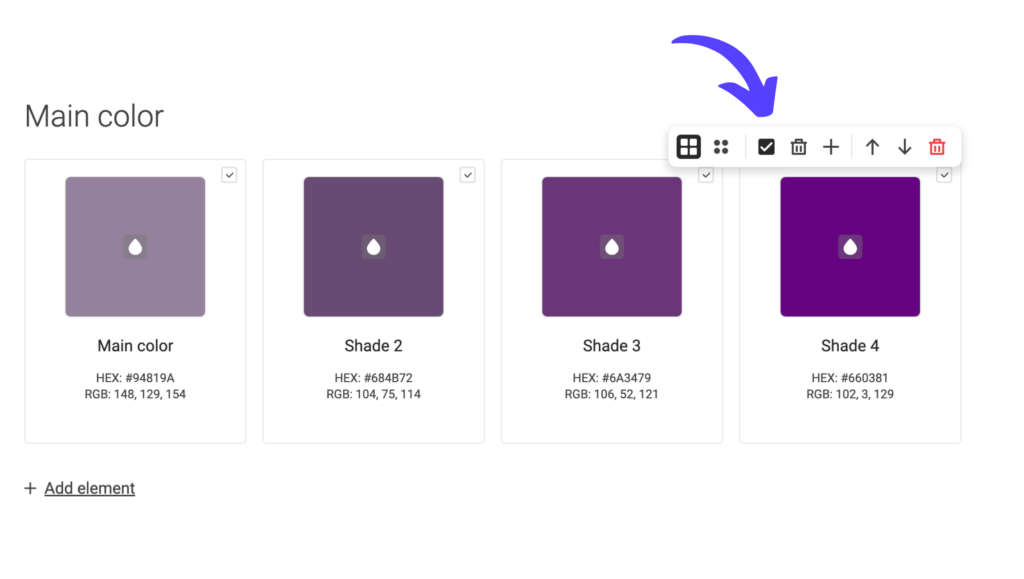
Deleting Marked Colors: The black trashcan symbol allows you to delete marked colors effortlessly, keeping your palette organized and clutter-free.
Adding Colors: The plus symbol lets you add additional colors to your palette, letting you add as many colors as you wish!
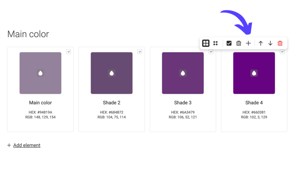
Reordering the palette: Utilize the arrows to move the palette up or down on the page, facilitating better organization and arrangement to your liking.
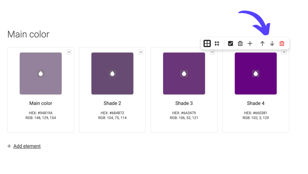
Deleting the Entire Palette: The red trashcan symbol deletes the entire palette. However, rest assured that a prompt will appear to confirm your action, preventing accidental deletions.
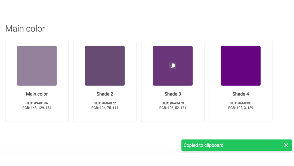
Speeding Up Your Workflow
Copying Colors: Did you know that you can quickly copy a color to your clipboard by clicking on it? This feature saves time and eliminates the hassle of manually selecting and copying color codes.
Utilizing the Drop Tool: Take advantage of the drop tool to swiftly add colors from external sources such as websites, images, or existing brand palettes. This functionality streamlines the process of incorporating specific colors into your design projects.
Native Color Picker: Depending on your browser, the color picker changes accordingly. Here is what the color picker would look like in Safari.
We work continuously to make the color palette as effective as possible for both agencies and their end-users. If you have ideas about improvements or feel like something is missing, we would be happy to hear your thoughts. Contact us at sales@brandguide.io for a chat!
Check out the agency pricing here: Agency Pricing